The long ignored issue of inequality is now center stage in the global debate about economic policy. The collapse of the global financial system in 2007 and 2008 and resulting economic downturn and debt crises have acted as a catalyst for growing anxiety around the increasing dispersion of incomes within most advanced economies.
Click here for an interactive version of the chart
The acute loss of job prospects, especially among the young, the credit crunch, and the austerity measures implemented by governments to contain the sovereign debt crisis have all put an extra burden on the shoulders of the lower and middle classes. Public discourse has started to openly debate the economic implications, as well as the legitimacy, of increasingly powerful elites seizing a growing share of the national pie year after year. These concerns led Christine Lagarde, the Managing Director of the International Monetary Fund, to point to the need for “addressing inequality and building inclusive growth” as one of three “milestones” of the future global economy.
To make sense of these concerns and offer advice on policy, we need hard evidence about the extent of economic inequality, about how it is changing, and about how it compares across nations. Interestingly, researchers and scholars have also begun to single out inequality as one of the structural causes of the recent financial crisis. This has led us to compile the Chartbook of Economic Inequality.
This project presents a summary of evidence regarding the long-run changes in economic inequality for 25 countries over more than 100 years. The countries selected represent more than a third of the world’s population: Argentina, Brazil, Australia, Canada, Finland, France, Germany, Iceland, India, Indonesia, Italy, Japan, Malaysia, Mauritius, Netherlands, New Zealand, Norway, Portugal, Singapore, South Africa, Spain, Sweden, Switzerland, the U.K. and the U.S.
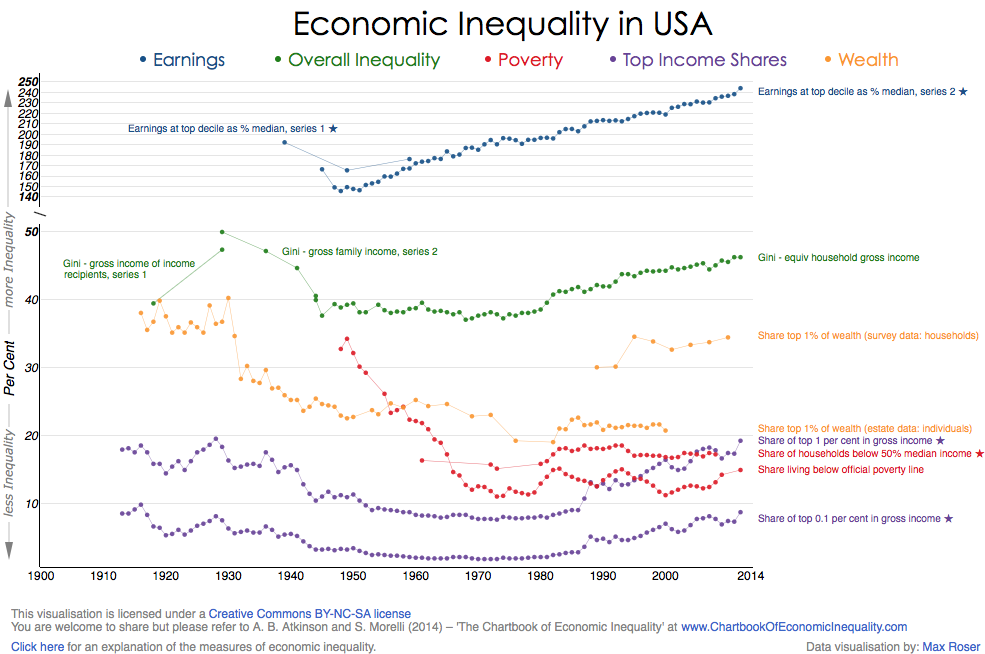
So what do we mean by inequality? Inequality of what and among whom?
Different people care about different dimensions of inequality, but these dimensions are often confused. We begin with the distribution of income, i.e. the total amount of money that people receive in earnings, investment income, and government and other transfers, after allowing for the income tax paid. In addition, we consider the separate roles of labor income and capital income, and have therefore shown the long-term changes in the distributions of earnings and wealth.
We are concerned with the overall distribution, commonly measured by the Gini coefficient of inequality, but we also follow what happens to poverty and to riches. The Chartbook shows the share of the top 1%, and the proportion of the population living below the poverty line.
Our research emphasis is on change over time. We have therefore concentrated on comparability over time, and for this reason the evidence is presented country-by-country. The underlying figures are available for download at: www.chartbookofeconomicinequality.com, a website developed and designed by Max Roser.
The main aim of this project is to enable readers to draw their own conclusions about the factors influencing inequality. But we also have included underneath each chart a table summarising our answers to the following questions:
- Has the dispersion of earnings been increasing in recent decades?
- Has overall income inequality increased in recent years?
- Have there been periods when overall inequality fell in a sustained way?
- Has poverty been rising or falling over the past decades?
- The US and certain other countries have seen top income shares first fall and then rise, is there a U-shaped pattern of this kind?
- Has the concentration of wealth moved in the same way as income inequality?
Admittedly, these are only some of the questions that readers will want to ask. But they capture the issues in current debate about the evolution of economic inequality.